
Key Takeaways
- Begin with the reader’s task, not every detail your organization has available.
- Organize pages so essential answers are easy to find in seconds.
- Use plain language, clear headings, practical visuals, and readable type.
- Select a format that fits the setting, whether readers are seated, standing, traveling, or taking notes.
- Test a physical proof and collect feedback before creating the next edition.
A printed guide can make a busy experience feel manageable. Whether it supports an event, school program, visitor center, workshop, nonprofit service, or community project, it gives people a dependable place to look when they need an answer quickly. Formats such as the Printivity booklet collection can be useful when a project needs multiple sections, schedules, maps, instructions, or reference material in one portable piece.
Print still has a practical place in 2026 because it does not require battery life, signal, an account, or a search bar. A well-planned guide helps someone confirm where to go, what to bring, or what happens next without interrupting staff or navigating a phone screen. The goal is not simply to put information on paper. The goal is to help readers take the right action with confidence.
Why Printed Guides Still Have a Place
Physical guides work especially well at welcome desks, classrooms, conferences, festivals, orientation sessions, and public programs. Readers can mark pages, compare details at a glance, and hand the guide to another person. They also provide a calm fallback when a digital schedule changes slowly, a website is difficult to use on a small screen, or a visitor has limited mobile access.
A guide is most valuable when it has a specific purpose. It should reduce uncertainty, not become a catch-all archive. The principles of information design are helpful here: choose relevant content, emphasize what matters, and use visual structure to help people understand and act.
Define the Guide’s Main Job
Before writing a headline or choosing a cover image, decide what readers must be able to do. A guide may help people find a location, follow a schedule, learn a process, compare choices, complete a task, make a decision, or take the next step. Trying to make one guide do all of these equally well usually produces clutter.
Questions to Answer First
- Who will use the guide, and what do they already know?
- What problem should it solve first?
- Where will people read it, and how much time will they have?
- Will they be standing, walking, attending a session, or working through a task?
- What should they do after reading it?
Build a Simple Content Plan
Start by listing every topic stakeholders want to include. Then edit with discipline. Remove details that do not support the main job, combine related information, and move lower-priority material to a final reference section. Put the most urgent content near the front, such as a schedule, map, eligibility requirement, emergency contact, or first step.
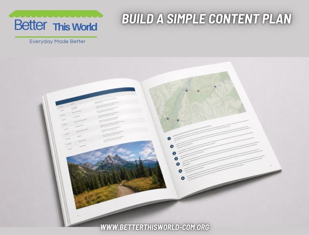
Ask someone who was not involved in the project to review the order. If that person cannot quickly explain where they would look for key information, the structure needs work. A simple sequence often works best: quick summary, contents page, main sections, instructions or schedules, frequently asked questions, and contact details.
Use a Reader-Friendly Page Structure
Most people scan a page before deciding whether to read it closely. Give them obvious entry points with descriptive headings, short paragraphs, bullets, numbered steps, and visible dates, times, prices, locations, and phone numbers. Repeat vital information when readers may need it in more than one context, such as a room number in both the agenda and map sections.
Write for Fast Reading
- Use familiar words when they communicate the idea accurately.
- Put the main point at the beginning of each section.
- Use active sentences and one central idea per paragraph.
- Explain unfamiliar terms before repeating them.
- Replace vague language with a direct action.
Less useful: “Participants are encouraged to proceed to the designated area at the appropriate time.”
Better: “Go to Room 204 ten minutes before your session begins.”
Make Design Support the Message
Design should guide attention, not compete with the words. Use a small, consistent set of type styles; make body text comfortably readable; and create contrast between headings, labels, and regular copy. Leave white space around important items, keep related information close together, and use color to signal categories or urgency rather than decoration alone.
Images should explain, prove, or add useful context. A photo of a building entrance may help visitors recognize the correct location. A decorative photo that crowds out a schedule does not. Maps, timelines, checklists, icons, callout boxes, and numbered steps can make complex information easier to use, provided every label remains readable.
Choose the Right Format for the Setting
- Short handouts: Best for reminders, simple instructions, and one-page schedules.
- Multi-page guides: Useful when readers need several connected sections, such as maps, policies, and agendas.
- Workbooks: A strong choice for training, exercises, note-taking, and reflection.
- Program guides: Helpful for performances, conferences, festivals, and public events.
- Reference manuals: Better for procedures readers will revisit over time.
Consider handling conditions as carefully as content. A guide used while walking should be compact and quick to scan. A workshop guide may need writing space and durable pages. A large event guide should make room names, session times, accessibility details, and wayfinding information easy to locate.
Design for Access and Inclusion
Make the guide easier for more people to use by choosing strong text-to-background contrast, avoiding important text over busy images, and never using color as the only signal of meaning. Use plain language for essential directions, readable labels on charts and maps, and translations when the audience needs them. Providing a digital version also gives readers options for larger text and assistive technology. Guidance on accessible communication consistently supports simple language, clear layouts, and predictable structure.
Review Before It Goes to Print
- Check spelling, grammar, names, dates, times, prices, addresses, and contact details.
- Confirm that page numbers match the contents section and headings use consistent terms.
- Test every QR code, web address, and short link.
- Print a sample copy and inspect it under normal reading conditions.
- Ask a first-time reader to find three important details without help.
- Fix every point where they pause, guess, or misunderstand the next step.
Common Mistakes and Better Measures of Success
Avoid cramming in every available detail, shrinking type to fit more copy, hiding key facts in long paragraphs, changing terms from page to page, and skipping a physical proof. Also, remember that information can expire. If schedules, prices, or policies may change, include a clear update path through a QR code, web page, or contact method.
Measure success by reader behavior rather than appearance alone. Track repeated questions, note help-desk bottlenecks, ask which pages were used most, review QR scans, and collect feedback after the event or program. A strong printed guide helps people move forward with less confusion, fewer delays, and greater confidence.